Wondering how to use Showit? This Showit Tutorial will provide you with a complete overview of the Showit Dashboard.
Whether you’re an existing Showit user who needs a bit of a refresh, or a complete beginner when it comes to the Showit Website Builder, this video is for you. It will also be helpful for DIY website builders and bloggers wanting to know how to start a website.
This Showit Website Tutorial will give you a full rundown of how everything works within Showit so that you can ditch the overwhelm and update your brand new Showit website with ease.
Choose your preferred learning style:
- Watch the video
- Read the blog post below
When you login to Showit for the first time, the first thing you want to do is select a template to work with. Showit has a range of free templates available for use as well as premium templates that you can purchase from the Showit Marketplace.
Once you’ve selected your template, you’ll be directed to the main design dashboard. This is what we will be covering today.
Showit Dashboard Overview:
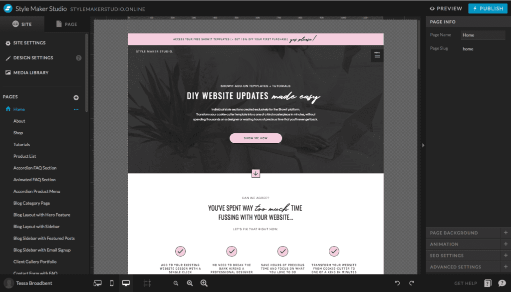
Starting from the top left-hand corner, we have the following sections:
Website Name and Connected Domain:
Your website name is generally your business name e.g. Style Maker Studio. If you have purchased a template from a Showit Designer, this will likely display the template name followed by the designer’s business name (e.g. My Willow by Style Maker Studio). You can update this at any time by selecting ‘Site Settings’ from the left-hand menu and updating the ‘Site Name’ field.
Your connected domain will appear next to your site name once your URL has been linked to your website. Showit will take care of this for you after your subscription payment has been processed (detailed instructions on how to request a domain connection will be sent to you from the Showit team).
Site Settings, Design Settings and Media Library:
These sections will be covered in detail further into the blog post.
Pages:
Following on, we have a list of all of your website pages e.g. Home, About, Services etc.
Blog Templates:
Blog Templates are pages which are connected to WordPress. The most common templates that will appear here will be your Blog Landing Page and your Single Post Page.
Site Canvases:
Your Showit website pages are essentially made of two different canvases: page canvases and site canvases. Site canvases are canvases that are used across multiple pages of your website e.g. Navigation Menu. Any page canvas can easily be converted to a site canvas by clicking on the ellipses icon next to the specific canvas and selecting ‘Convert to Site Canvas’.
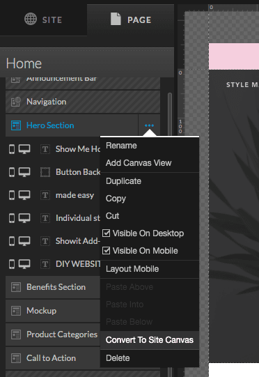
Any changes made to a site canvas on one page will automatically update across every other page that the particular site canvas has been added to.
Site canvases can be identified by the diagonal line pattern that appears across the canvas name in the ‘Page Settings’ tab.
User Profile:
The User Profile section is where account settings can be accessed. We will cover this in more detail further into the blog post.
Mobile and Desktop Views:
Desktop and mobile layouts are designed separately in Showit. Any design element you add to desktop will be added to mobile and vice versa. You can choose to hide or display any element from either desktop or mobile views.
Zoom Buttons:
Zoom buttons allow you to zoom in and out of your design.
Design Tools:
The design tools are activated when a canvas is selected. Choose from text options, shapes and embed options and the media library.
Undo and Redo Buttons:
These buttons allow you to undo or redo any changes you have made to your website design.
Individual Canvas Information:
This will appear on the right-hand side when a canvas is selected. We will cover this in more detail soon.
Preview and Publish Buttons:
Showit allows you to preview changes that you make on your site without making them visible to your visitors. Changes won’t take effect until you hit publish.
Showit Account Management:
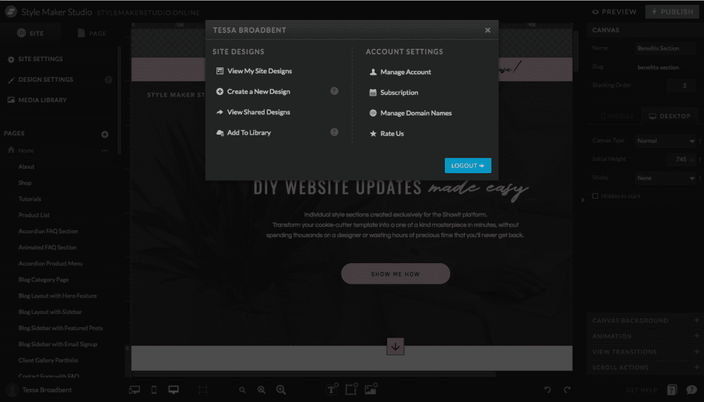
Your Account Management settings can be accessed by selecting your profile button in the bottom left-hand corner of the screen. There are two main sections – site designs and account settings.
Site Designs:
View My Site Designs:
This section is where you can find your primary website template as well as any other plus sites you have created. Showit allows you to have an unlimited amount of plus sites without needing to configure anything with your domain provider. Plus Sites are basically sub-domains of your primary domain e.g. clientportal.stylemakerstudio.online.
Create a New Site Design:
Clicking here allows you to create a new +site using a subdomain of your main domain.
View Shared Designs:
This is where you can view designs which have been shared with others via a Unique Share Key.
Add to Library:
This is where you can add a new design to your library. Choose from a selection of free designs or upload a template that has been shared with you using a unique Share Key.
Account Settings:
Manage Account:
This will open a tab for your Showit Account. Your Showit Account is where you can update your personal information, change your password and access recent emails sent through your website contact form.
Subscription:
Clicking here will allow you to view details of your current subscription with Showit, including payment frequency, past invoices and billing information.
Manage Domain Names:
This is where you can manage your primary domain as well as any sub-domains (plus sites) that have been created. Domains can be enabled or disabled on this screen.
Rate Us:
In this section, you can leave a review about your experience with Showit.
Log Out:
Clicking here will log you out of your Showit account.
Site Settings:
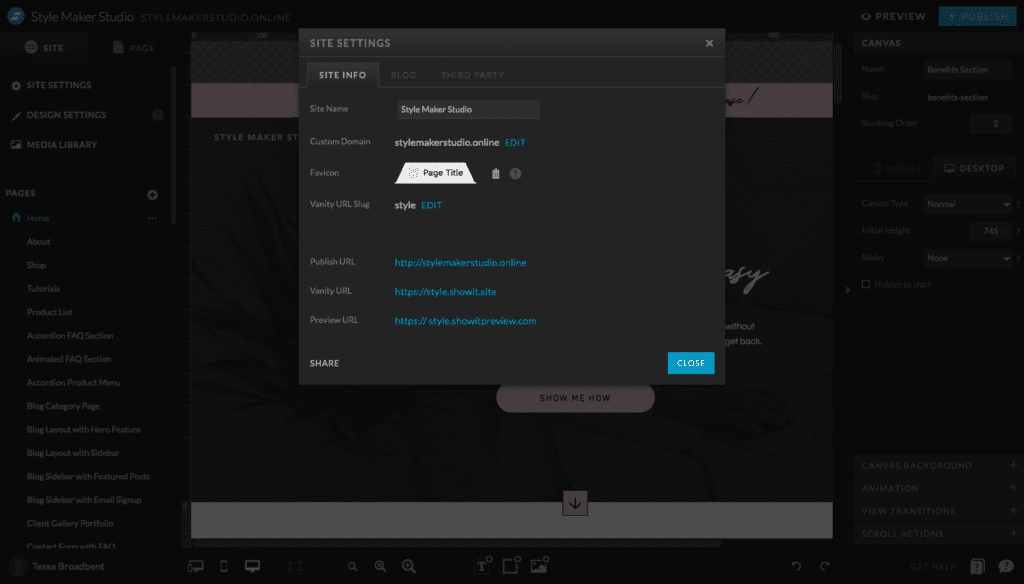
The Site Settings Section displays important information about your connected domain.
Site Info:
Site Name and Custom Domain:
As mentioned earlier, your site name is generally the name of your website. If this is your primary website design, this will most likely be the name of your business e.g. Style Maker Studio.
Custom domain is where your website URL will appear once connected by the Showit team. Click here to access detailed instructions on how to request a domain setup through Showit.
Favicon:
A favicon is an icon that is associated with your website. It will appear next to your website name when you open a tab. You can upload your custom favicon by adding it to your Media Library and selecting ‘Choose Image’. Keep in mind that for best results, your favicon should be 32px x 32px and saved as a .PNG file.
Vanity URL Slug:
A vanity url essentially connects your website to Showit prior to having your custom domain connected. For example, if my vanity url is stylemakerstudio, this is what will be used for the preview URL so I can view my website and any changes made, before hitting publish.
Share:
Clicking this button will assign a Unique Share Key to the template you are editing. If we were creating a template that we wanted to later share with others or even sell to customers, we could select this button to create the Unique Share Key. They would then import this Unique Share Key into their Showit Library to copy the template design across to their account.
Blog:
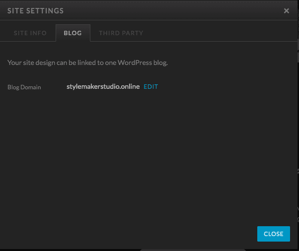
Blog Domain:
This is where the domain for your blog is displayed. Showit gives the option of either linking your blog to your main domain (e.g. www.stylemakerstudio/blog) or specifying a separate sub-domain to link your blog to (e.g. www.blog.stylemakerstudio.online).
I generally recommend linking your blog to your main domain so that your website visitors can access the features of your main site easily if they decide to click away from your blog page, rather than it being on a completely separate domain. Linking it to your main domain is also more beneficial in terms of SEO purposes.
Third Party:
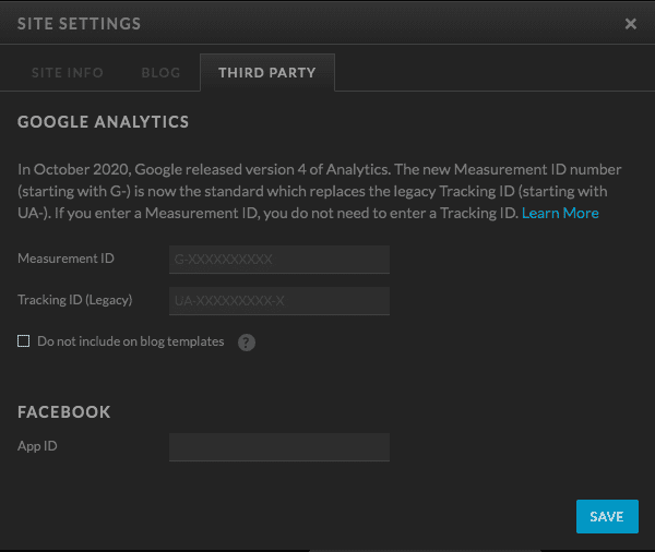
Google Analytics and Facebook App ID:
This is where you can add your Google Analytics ID as well as your Facebook App ID. For instructions on how to connect Google Analytics to your website, click here.
Design Settings:
The Design Settings section is made up of two main tabs: Site Style and Fonts.
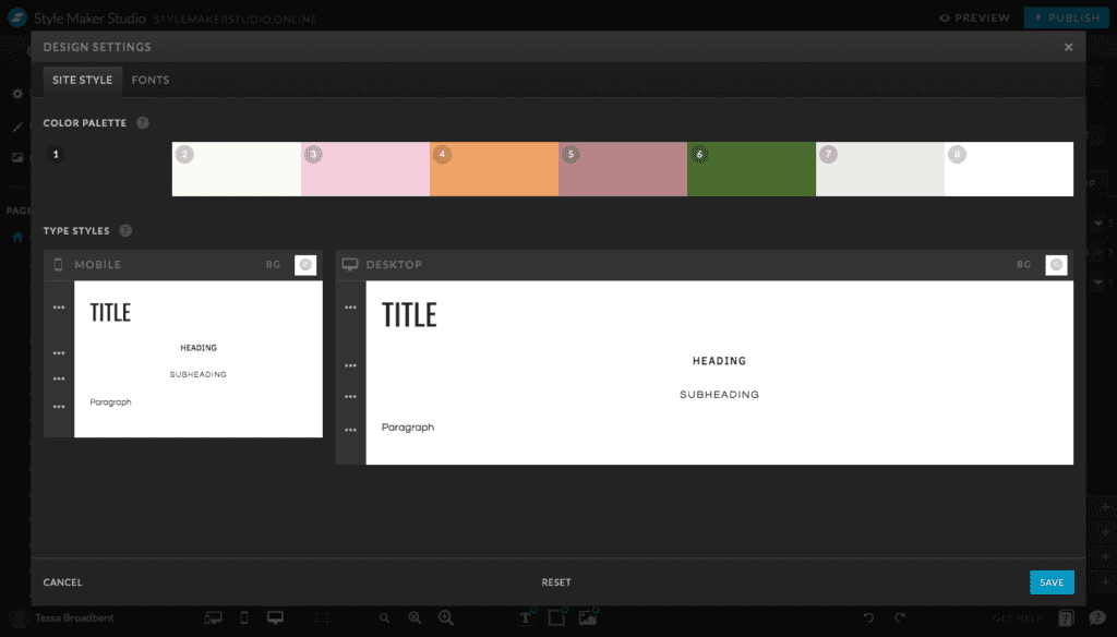
Site Style:
Colour Palette:
The top section of the ‘Site Style’ tab is where you can set your main colour palette for your website. One colour palette is applied across desktop and mobile devices.
Showit gives you the option of saving eight colours in the palette. I generally always leave the last swatch as white though, for quick and easy access when I am designing a website.
You do have the option of using colours outside of your main palette, however adding your primary colour palette here first makes it easy when it comes to maintaining consistency. Style consistency will also allow you to maintain a higher level of professionalism.
Keep in mind that if you change the primary palette, this will update the colour selections for the entire site.
Type Styles:
Desktop and mobile font selections have been separated. However, I recommend using the same font styles across all devices to maintain consistency.
To change the fonts, you simply select the three dots and update the default setting styles. The dropdown list will contain all of the fonts that you have added in the ‘Fonts’ tab.
Fonts:
This is where you can add new fonts. You will need to select your chosen fonts from the ‘Google Fonts’ list in this tab before they can be added under the ‘Type Styles’ tab.
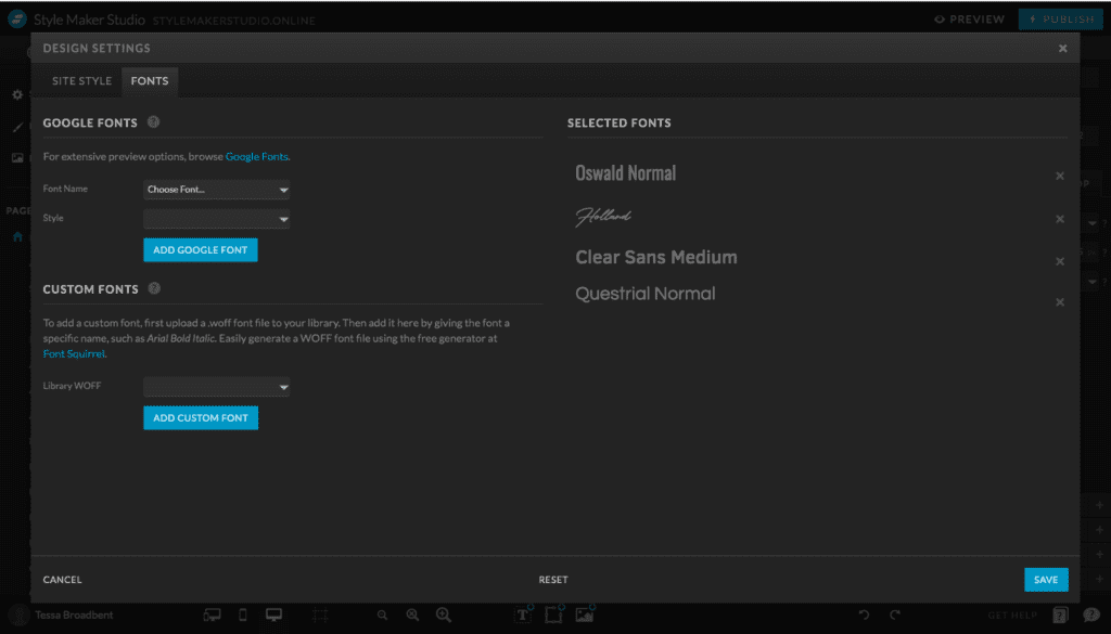
Custom Fonts:
Showit also gives you the option of adding custom fonts. Custom fonts need to be uploaded as .WOFF files to your Media Library before they can be added to the ‘Custom Fonts’ dropdown list. Once uploaded in your Media Library, they will appear in the dropdown list and can then be added to your ‘Selected Fonts’ list.
Mobile and Desktop Views:
The design of the Desktop version is separate to the design of the Mobile version. If you make changes on the desktop version, you have to also alter the layout design of your mobile site to accommodate those changes.
Although it might seem time consuming, this is how you can control exactly what your website visitors see whether they are using a laptop or a mobile device.
Choose to hide or display certain elements from either the desktop or mobile view.
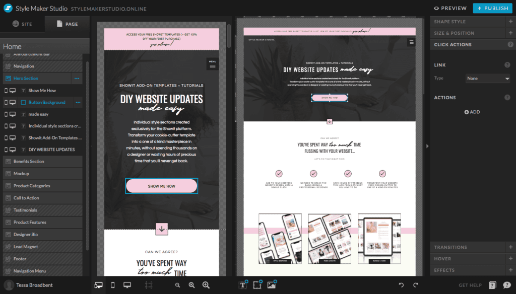
Site Elements:
This is where your pages, blog templates and site canvases will appear on the Showit dashboard.
Pages:
This is where all of your website pages will appear e.g. Home, About, Services etc.
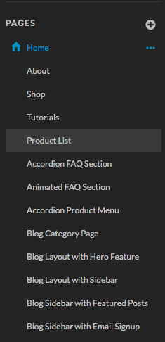
Blog Templates:
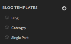
Blog Templates are pages which are connected to WordPresss. The most common templates that will appear here will be your Blog Landing Page and your Single Post Page. Keep in mind that the blog templates are for the design only. Blog post creation, editing and publishing is done within the WordPress dashboard.
In addition to these pages, you can also create post category pages, 404 redirect pages, search pages, archive pages and more. This is a more advanced feature, so we won’t go into this too much now.
Site Canvases:
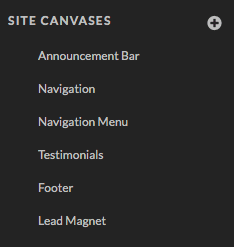
Your Showit website pages are essentially made of two different canvases: page canvases and site canvases. Page canvases are canvas sections which are used once on a particular page of your site.
On the other hand, site canvases can be used across your entire website. This prevents you from having to design the same section over and over again.
For example, the navigation section of my site is something that I want to appear on every page. Instead of designing it every time I create a new page, I can design it once, convert it to a site canvas and simply add the design from the site canvases list.
Any changes made to a site canvas on one page will automatically update across every other page that the particular site canvas has been added to.
Page Elements:
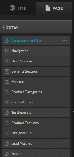
Under the Pages Tab is where you will find a list of all of the sections that make up an individual page design.
The sections are ordered depending on where they appear on the page. This makes it very easy if you want to change the position of a particular section. All you need to do is hold and drag the section to rearrange the order.
Canvas Settings:
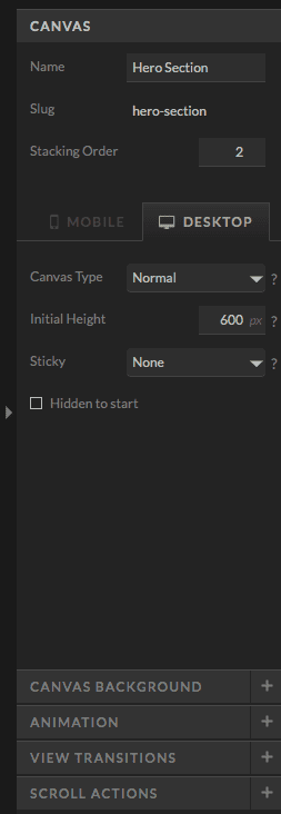
Selecting a particular canvas from this list, will trigger the specific settings for that canvas to show up on the right-hand side of the dashboard in the ‘Canvas Settings’ section.
Canvas:
When designing a website, I generally prefer to label my canvases according to the specific purpose. This makes it much easier when it comes to structuring my website and knowing the objectives of each section e.g. Navigation Menu, Hero Section, Benefits Section etc.
Stacking order refers to a layer hierarchy. Stacking order is particularly useful when we are using sticky navigation menus for example. If I am creating navigation bar that needs to scroll over every other element of the page, I need to increase the stacking order number of that canvas so it sits on top of everything else.
Further down, we can see the ‘Canvas Type’ for both desktop and mobile.
- Normal: The canvas is set to display using the dimension settings in the dashboard.
- Window Height: The canvas will take up the entire display area of the screen.
- Grow with Content: Relates to the WordPress Dashboard. Used mainly for Blog Templates and Single Post Templates when there is an option to increase how much content is seen by the website user e.g. blog post content, blog post summary number.
Initial height refers to the size of the canvas e.g. 600px. This is the size that the canvas will be when ‘Normal’ is selected as the ‘Canvas Type’.
The ‘Sticky Setting’ is used for sticky navigation menus or elements that we want to set to stick to the top or bottom of the screen. Select from ‘None‘, ‘Top‘, ‘Bottom‘, ‘Top on Scroll‘, ‘Bottom on Scroll‘.
Canvas Background:
This is where you can change the background type of the canvas for both the desktop and mobile design. Choose between ‘None‘, ‘Colour‘, ‘Image‘ or ‘Video‘.
Animation:
This setting allows you to add subtle animations to the canvas.
View Transitions:
This setting is used in conjunction with canvas views. Canvas views are used to display different design elements on the same canvas e.g. Testimonial canvas transitioning through each individual client testimonial at a time.
Scroll Actions:
Allows you to trigger certain actions when someone scrolls over a specific section of your website e.g. automatic newsletter popup.
I hope that you found this tutorial helpful. Feel free to leave any comments or questions below – I would love to hear from you.
If you want more Showit tips and tutorials, don’t forget to subscribe to my YouTube Channel and press the bell icon so you get notified each time I upload a new video.
See you next time!
